
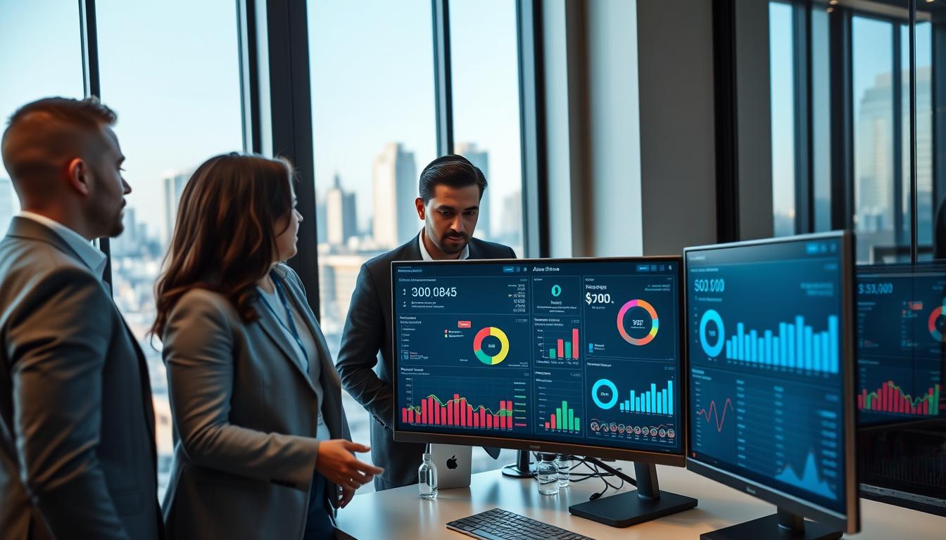
Throwing tech at a gathering is easy. But the real magic is in the data. Welcome to the era where we focus on real engagement, not just tech.
This isn’t about counting heads. It’s about understanding how people connect. We’re diving deep into what makes a tech event successful. It’s like a digital autopsy, but for something alive.
Technology is changing how we plan and enjoy events. Tools like AI and AR are now key. But how do we know if they’re really making a difference?
Every interaction tells a story. From cashless payments to AR experiences, we’re tracking innovation’s pulse. Get ready to explore the heart of event technology analytics.
Mobile App Performance Metrics
Your event app download count is like a participation trophy. It looks good but doesn’t show real event tech performance. The real story is in how people use it every day. Is your app a tool for real engagement or just a digital brochure?
Forget about vanity metrics. We’re looking for real insights. Think of your app as a digital Swiss Army knife. Success isn’t just about how many you have, but how well they work.
The real story is after people install it. Daily Active Users (DAU) show who’s really using it. How long they stay shows if they’re really engaged or just looking for something else.
How people use your app’s features is key. Did the networking tool help people connect, or was it ignored? Polls often show what people really think, more than a show of hands.
Your messages are also under the microscope. Push notification open rates show if you’re sending useful updates or just spam. They tell you if you’re reaching people or just annoying them.
The coolest analysis is like being a digital flâneur. By tracking how people move through your app, you see what they’re interested in. This shows you what to improve for next time.
| Metric Type | Example | The Vanity Trap | The Actionable Intelligence |
|---|---|---|---|
| Reach Metric | Total Downloads | Shows promise, but doesn’t show use. It’s an empty seat at the digital table. | Daily Active Users (DAU) & Session Length. This shows who’s really there. |
| Feature Metric | “Has Networking Feature” | A spec sheet checkmark. It doesn’t show if anyone uses it. | Meeting Requests Sent/Accepted & Poll Response Rates. These show real interaction. |
| Communication Metric | Push Notifications Sent | It’s about how many, not if they matter. You can shout into a void. | Open Rate & In-App Action Rate. Did the message make a difference? |
| Engagement Metric | App “Opened” | A simple yes or no. Was it a quick look or a deep dive? | Navigation Path Analysis & Screen Time per Feature. This shows what people are really interested in. |
Changing focus from vanity to value makes your app valuable. It’s not just about being there, but about being useful. This is the heart of event tech performance analysis.
Live Streaming Analytics
Live streaming analytics turn your event into a global lab. They measure how engaged your audience is and how well your message hits home. It’s not just about broadcasting content; it’s about running a big, real-time experiment.
Every click, view, and comment is a clue. They help you understand what works best. This data is key to improving your content.
Start with concurrent viewership numbers. These show how many people watched live. But, a dip in viewers during a keynote isn’t a failure. It’s a story waiting to be told.
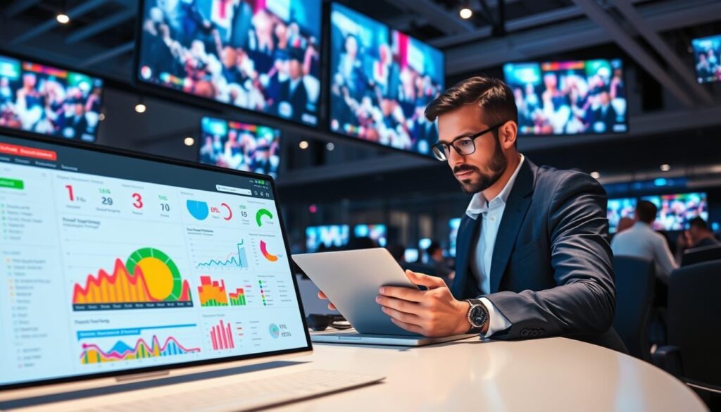
Watch time tells you if your content is good. If people stick around, it’s a hit. But if they leave quickly, it’s a red flag.
The chat is like a live focus group. It shows what people really think. Tools can analyze this, telling you if the audience loves or hates what you’re saying.
Don’t ignore technical data. It shows if your event was smooth or not. If many saw a spinning wheel instead of your big reveal, that’s a problem.
After the event, you’ll find hidden gems. A session might not have many live viewers but gets lots of views later. This is where streaming analytics really shine.
So, what should you measure? Here’s a quick guide to the top digital event metrics:
| Metric | What It Measures | Why It Matters | Benchmark for Success |
|---|---|---|---|
| Peak Concurrent Viewers | Maximum number watching simultaneously | Shows content’s immediate draw and hype | Consistent peaks during key sessions |
| Average Watch Time | How long viewers stay engaged | Indicates content quality and holding power | Over 50% of total session length |
| Chat Engagement Rate | Percentage of viewers who comment/react | Measures active participation vs passive watching | 10-15% of live audience participating |
| Rebuffer Percentage | Viewers experiencing stream interruptions | Quantifies technical experience quality | Under 2% of total audience |
| On-Demand View Growth | Increase in views after live event ends | Shows lasting value and content discoverability | Views doubling within 7 days post-event |
Connecting these dots is where the magic happens. Low live viewership but high chat engagement might mean you’ve found a niche audience. High numbers but low watch time means great marketing but not-so-great content. This is where live streaming analytics really shine.
Remember, streaming extends your reach, but analytics deepen your understanding. They show not just how many people watched but how many connected. In the world of hybrid and virtual events, these digital event metrics are your guide, critic, and future predictor all in one.
Why Attend Technology ROI Events?
Attending technology ROI events is a smart move for businesses looking to boost their bottom line. These events offer a wealth of opportunities to learn from industry experts and network with peers. By attending these events, you can gain valuable insights into the latest trends and strategies for maximizing your technology investments.
At technology ROI events, you’ll have the chance to hear from industry leaders who have successfully implemented ROI-focused technologies in their own organizations. Their real-world examples and case studies will provide you with practical knowledge and inspiration to apply to your own business.
Networking is another key benefit of attending technology ROI events. You’ll have the opportunity to connect with professionals from various industries and backgrounds. These connections can lead to valuable partnerships, collaborations, and even new business opportunities.
By attending technology ROI events, you’ll stay up-to-date with the latest industry trends and advancements. You’ll gain a deeper understanding of how to measure and optimize the return on investment (ROI) of your technology initiatives. This knowledge will empower you to make informed decisions and drive growth in your organization.
So, why not take advantage of the opportunities that technology ROI events offer? Stay ahead of the curve, learn from industry experts, and connect with like-minded professionals. Attend technology ROI events to maximize your technology investments and drive business success.
Benefits of Attending Technology ROI Events:
- Gain valuable insights from industry experts
- Learn from real-world examples and case studies
- Network with professionals from various industries
- Stay up-to-date with the latest industry trends and advancements
- Make informed decisions to drive business growth
Event Tech Performance: How to Measure Success
Measuring the success of event tech is key to understanding its impact. It helps us see if the tech is meeting our goals. We can use metrics like user engagement, feedback, and how well the tech works.
Looking at user engagement shows if people are using the tech. We can track how often it’s used and how long people stay on it. This tells us if the tech is meeting our needs.
Feedback is also important. We can ask people what they think of the tech. This helps us know what’s working and what needs to change.
How well the tech works is another key measure. We can check for bugs and see if it’s easy to use. This ensures the tech is reliable and user-friendly.
By looking at these metrics, we can see how well our event tech is doing. This helps us make it better for future events.
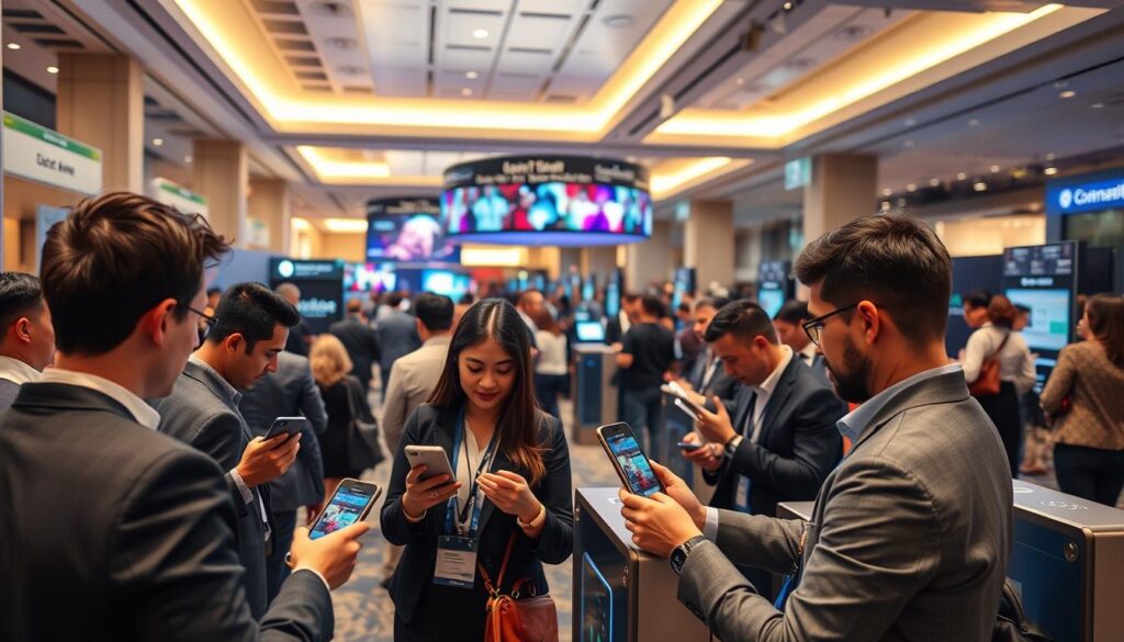
Example of Event Tech Performance Metrics:
| Metrics | Description |
|---|---|
| User Engagement | Tracks how often and long users interact with the event tech. |
| Feedback | Collects user opinions on the event tech. |
| Technical Performance | Checks for bugs and ensures the tech is easy to use. |
Wi-Fi and Connectivity Usage
In today’s world, having good Wi-Fi is essential, not just a nice-to-have. When Wi-Fi fails, it’s like a shock to your event. We’ve all felt that worry when our phone can’t find a signal in a crowded place. That’s a critical failure in your event’s digital health.
So, what should you watch? It’s not just about how many people are online. True Wi-Fi analytics look at three main things:
- Total Connected Devices: How many phones, tablets, and laptops are on your network.
- Data Consumption Per Hour: How much data your guests are using—is it a little or a lot?
- Bandwidth Utilization by Zone: A map showing where the most data is being used in your venue.
This data shows you a lot. Was the network struggling during the main event? That’s when everyone is live-streaming and posting at once. Or did it slow down in the exhibition hall? That’s probably because lots of people were downloading apps and trying out AR experiences.
But, it’s not just about big outages. Latency and packet loss are sneaky problems. They make your app slow, live polls fail, and turn a smooth experience into a frustrating wait. Watching these metrics is like keeping an eye on your network’s health.
This info helps you stay ahead. It answers the question before anyone even asks: “Can I get online?” By looking at past digital event metrics, you can plan for the future. It makes a big difference between a venue that’s easy to connect to and one that feels cramped.
Let’s look at what different areas of your venue need:
| Venue Zone | Primary Demand | Bandwidth Priority |
|---|---|---|
| Main Stage / Keynote | Live Streaming, Social Media Uploads | High Upload Speed |
| Exhibition Hall / Demo Area | App Downloads, AR/VR Content | High Download Speed, Low Latency |
| Networking Lounge | Email, Messaging, Light Browsing | Stable Connection, Moderate Speed |
| Registration & Entry | Digital Ticket Validation, App Access | Critical Reliability, Low Bandwidth |
This important part of your event is what makes everything else work. It’s not just about IT. It’s about respecting your guests’ need to stay connected. Good connectivity metrics make Wi-Fi a key part of your event’s success.
AR/VR Experience Engagement
Investing in AR treasure hunts or VR demos is like buying wonder. But how do you measure the ROI of awe? These technologies turn ordinary places into amazing ones. The magic is in proving they actually worked.
Augmented reality is all about that clever scavenger hunt. Its success isn’t just about how cool it looks. The first key is scan initiation rates. Did people even scan your markers?
Next, look at interaction depth. Did they just tap through once or dive deep into your digital world? This shows if they were just looking or really playing. Also, track completion rates for multi-step experiences. Did they see your story from start to finish?
Virtual reality is different. Here, session duration is key. Did users stick around for the whole demo, or leave early? Physiological response data like heart rate shows if they were excited. And did they want to share it with others? That’s the best sign.
| Metric Type | AR Engagement Focus | VR Engagement Focus |
|---|---|---|
| Initiation & Attraction | Scan rates for markers/triggers | Headset pickup & session start rates |
| Interaction Depth | Time spent with overlays, tap-through rates | Session duration, gaze tracking heatmaps |
| Completion & Advocacy | Multi-step journey completion percentage | Post-session survey scores, share/screenshot actions |
| Location Intelligence | Heatmaps of where scans occurred in venue | N/A (experience is location-agnostic) |
The last row in the table is key for AR. Heatmaps of scan locations show where people were curious. Was it the quiet corner or the busy lobby? This data checks your whole venue.
So, was your experience a journey or a waste of time? The data tells you. It shows if your tech created memorable moments. Proper AR/VR event management turns these metrics into a story of attendee wonder.
Proving the value of these technologies is about linking digital engagement to real results. Did the awe lead to more booth visits, better leads, or stronger brand recall? That’s how you measure technology ROI events success—not just by counting headsets, but by seeing the impact on people.
Digital Signage Effectiveness
Digital signage at events can feel like shouting in a crowded room. Does anyone actually hear you? Those sleek screens show schedules, maps, and promotions. But if no one’s looking, they’re just expensive wallpaper.
The real test of event tech performance isn’t just about the number of screens. It’s about how many people notice them. We’re talking about how long people look, interact, and convert. Did someone stop to read the announcement? Did they touch the map? Did they scan the QR code for the schedule?
This data is very honest. It shows if your signage helps or just clutters the space. With personal smartphones everywhere, your screens must compete for attention. Their effectiveness is shown by how people engage with them, not just by how many you install.
Let’s look at the important metrics. Dwell time shows how long someone looks at a screen. A quick glance is a miss, but a long pause is a win. Interaction rate tracks how many people touch or scan interactive displays. A high rate means your content grabs attention.
Conversion is also key. That “Scan for Schedule” prompt isn’t just for show. How many people actually scan it? This shows if your info changes behavior, like reducing confusion and guiding action.
The smartest move? A/B testing. Try an animated map on one screen and a static one on another. The data will show which one gets more attention. This turns guesses into strategies.
| Metric | What It Measures | Impact on Event Success |
|---|---|---|
| Dwell Time | Seconds an attendee spends viewing content | High dwell time means your info is engaging and cuts through the noise. |
| Interaction Rate | Percentage of viewers who touch or scan | Shows if your content prompts action, proving it’s more than just background. |
| Conversion Rate | Actions taken from displayed prompts | Directly links signage to behavioral change, like downloading schedules or signing up. |
| Content A/B Testing | Performance comparison of different formats | Eliminates assumptions, providing data-driven proof of what messaging works best. |
| Overall Engagement Score | Composite of all above metrics | Gives a holistic view of digital signage effectiveness for future planning. |
This table is your guide. When you know which metrics matter, you can design better signage. You stop broadcasting and start communicating effectively.
The bottom line? Digital signage performance metrics give you the feedback you need. They answer the big question: Did this technology make the experience better, or was it just for show? In the quest for top-notch event tech performance, the answer is everything. Your screens should solve problems, not create them. The data shows if they’re doing their job.
Security Technology Performance
Think of security tech as your event’s silent bodyguard. It doesn’t crave applause. Its success is measured in the crises that never happen. In the world of digital event metrics, this is the most paradoxical data set.
RFID and NFC technology from companies like HID Global create invisible fences. The data tells a story of attempted breaches that were politely, instantly denied. Camera analytics from systems like Cisco Meraki can spot a crowd surge before it forms. This isn’t about reaction time. It’s about preemption.
The best security metric is a blank page. Zero incidents. Zero disruptions. Yet the dashboard reveals the vigilance: unauthorized access attempts blocked, integration alerts between badge scans and session registrations. It proves the digital perimeter held.
This final piece of your analytics puzzle builds something priceless: attendee trust. People innovate and connect when they feel safe. Your digital event metrics must account for this invisible shield. When security works perfectly, the only thing your attendees need to worry about is finding the coffee station and a strong Wi-Fi signal.
So you’ve measured the app, the stream, the social buzz. You’ve tracked every digital ticket and AR experience. Now look at the quietest data. The absence of chaos is your loudest success. It means your digital innovation had a safe home. The event wasn’t just smart. It was secure.